Transforming fragmented data into clear, actionable insights across agencies
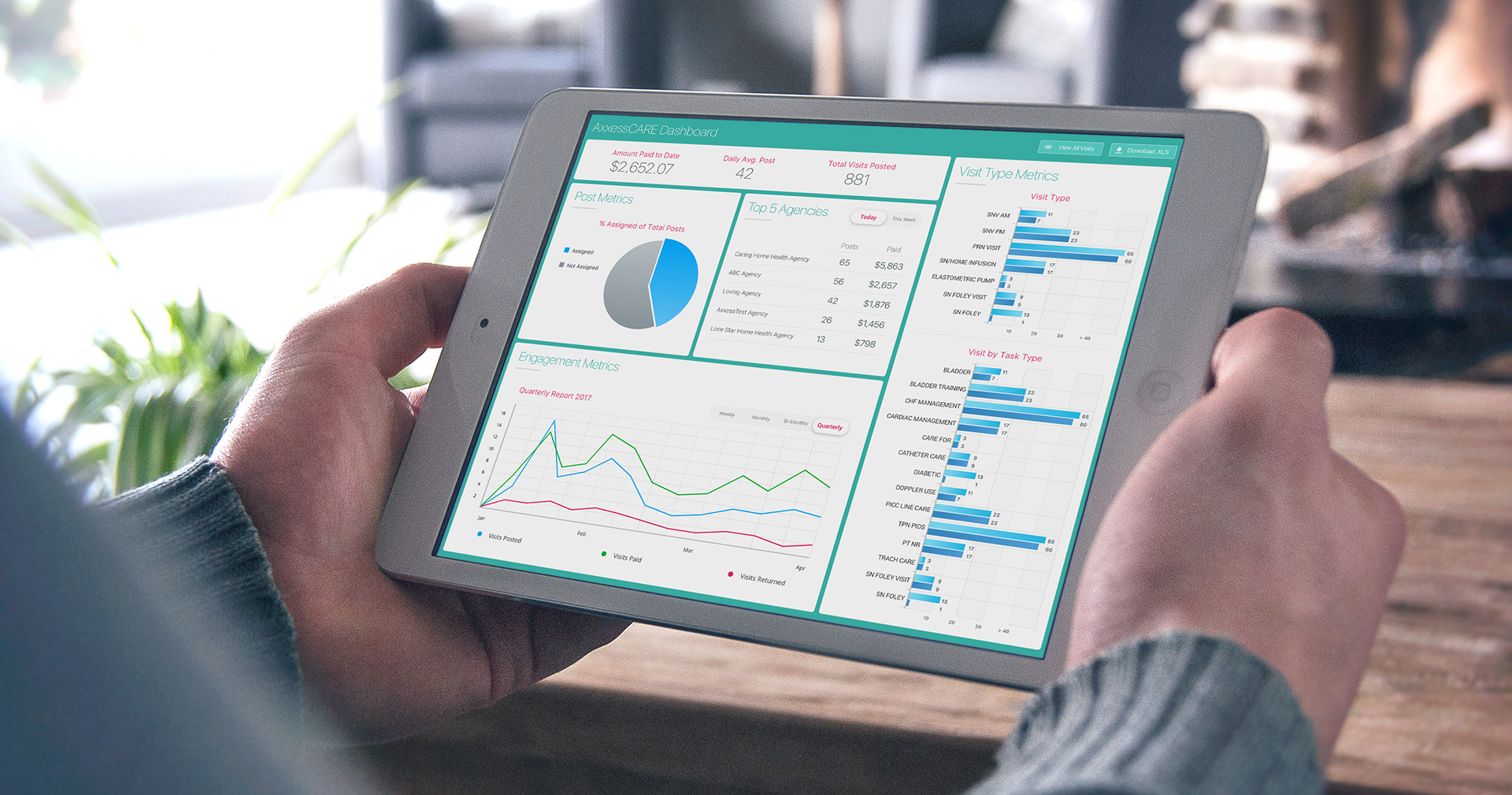
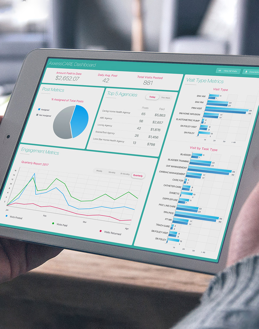
Clinical Agency Dashboard
As home health organizations scaled across multiple agencies, leadership lacked clear visibility into performance, financials, and platform usage across their network. I led the design and product strategy for a centralized dashboard that delivered real-time insights—enabling better decision-making, performance optimization, and scalable agency management.
2017
Healthcare SaaS, Web Dashboard
Lead UX & Strategy
IMPACT:
-
Improved visibility into agency performance and financial metrics.
-
Enabled faster, data-driven decision-making.
-
Increased adoption and usage of the AxxessCARE platform.
The Executive Problem
As home health companies expanded, managing performance across multiple agencies became increasingly complex.
Leadership teams lacked a clear, centralized view of key metrics, making it difficult to monitor performance, identify issues, and make informed decisions.
This created challenges such as:
- Limited visibility into agency-level performance and financials
- Difficulty tracking platform usage across agencies
- Delayed insights due to fragmented or manual reporting
- Inability to quickly identify trends or areas needing attention
The organization needed a solution that could bring critical data together into a single, actionable view.
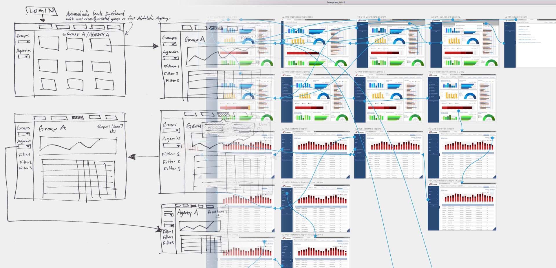
My Leadership Role
I led the design strategy for creating a dashboard that aligned business goals with operational and analytical needs.
My responsibilities included:
Problem Discovery
Identifying gaps in reporting, visibility, and decision-making workflows.
Stakeholder Alignment
Working with leadership, product, and engineering teams to define key metrics and priorities.
Design Leadership
Guiding the experience to ensure clarity, usability, and quick interpretation of data.
Validation
Testing and refining the dashboard to ensure it delivered meaningful insights in real-world scenarios.
Understanding the System
We began by analyzing how leadership teams currently accessed and interpreted performance data.
This included reviewing reports, spreadsheets, and existing tools used to track agency metrics.
We found that teams struggled to:
- Quickly access consolidated performance data
- Understand trends across multiple agencies
- Identify outliers or performance issues
- Measure platform usage effectively
These insights highlighted the need for a centralized, visual, and real-time analytics experience
Strategic Design Approach
Our strategy focused on making complex data easy to understand and act on. Key priorities included:
Visibility
Provide a clear, centralized view of performance across all agencies.
Clarity
Present data in a way that is easy to interpret at a glance.
Actionability
Enable users to quickly identify trends, issues, and opportunities.
The Solution
We developed a centralized dashboard that gives leadership real-time visibility into agency performance and platform usage. Key capabilities included:
- High-level financial and operational metrics overview
- Visual breakdown of visits, revenue, and engagement trends
- Agency-level performance comparisons
- Usage metrics for the AxxessCore platform
- Interactive data visualizations for deeper analysis
Research & Validation
The project combined data analysis with iterative design and agency feedback to ensure clarity and usefulness.
Data Mapping
Defined key metrics and relationships to ensure meaningful insights.
Stakeholder Feedback
Collaborated with leadership to validate data relevance and presentation.
Usability Testing
Refined the dashboard to ensure users could quickly interpret and act on the data.
Results
The dashboard significantly improved visibility and decision-making across the organization
Operational Impact
Faster access to critical performance data
Improved ability to monitor and manage multiple agencies
Customer Impact
Leadership could quickly identify trends and performance gaps
More confidence in data-driven decision-making
Platform Impact
Increased awareness and usage of the AxxessCARE system
What This Project Demonstrates
This project highlights how data visualization and product design can drive better operational decisions at scale.
Key takeaways:
- Clear, centralized data improves visibility and alignment
- Well-designed dashboards make complex information actionable
- Strong product strategy enables better decision-making across organizations
Have an opportunity in mind?
Let’s connect over coffee or have a quick virtual chat.